I recently got back from a wonderful trip across the pond to Iceland. I’d chalk it up to the best trip I’ve ever taken, which is quite the praise given the beautiful National Parks I’ve visited.
One of the things that’s always difficult about traveling abroad is the potentiality for a language barrier. Now, the vast majority of Icelanders speak English, so from a communication standpoint we were in the clear. However, when it comes to daily operation of a country, Icelandic is the primary language.
When you think about driving a vehicle, roads are constantly throwing information your way that you need to process. Information, I might add, that’s on top of managing your speed, worrying about fellow drivers, and making sure you’re heading in the right direction. In fact, it’s often quoted that drivers make obscene amounts of observations and decisions every two minutes.
There were a couple differences when driving in Iceland versus the United States:
- Everything is measured in metric, so that means understanding that speed limits are posted in kilometers per hour instead of miles.
- There are virtually no billboards or advertisements on the roadsides, meaning fewer distractions and a cleaner landscape. Seriously, can’t all states be like Maine and Vermont and follow suit?
- Road signs look similar, but some take a bit more thinking to parse out.
By having a foundational understanding of driving and experience doing so, I was able to navigate and interpret signs with hardly any issues. Had the design standards been drastically different, I’d probably still be lost out on the Ring Road.
This brings me to the topic at hand.
When designing board games, video games, or really any type of media to be consumed by others, it’s really important that you appeal to people’s assumed experiences and expectations. This allows people to feel comfortable in the game, because their brain is expecting certain signals and receiving those same signals.
When I first started playing a variety of board games, I lacked the experience to make logical inferences about certain iconography or gameplay mechanics. Over time, as I played more games, I began to see noticeable trends in design that made it easier to learn rules because I didn’t have to worry as much about the iconography. I could let my assumptions guide me.
Here are my three keys to board game design when it comes to visual layout and iconography:
- Use Recognizable Imagery
- Anticipate Questions
- Tidy Your Landscape
By following these three design queues, you’ll inherently make your games feel less mentally taxing by allowing players to focus on strategy instead of memorizing mechanics. You can probably intuit what a lot of these signs mean. They transcend language!


Use Recognizable Imagery
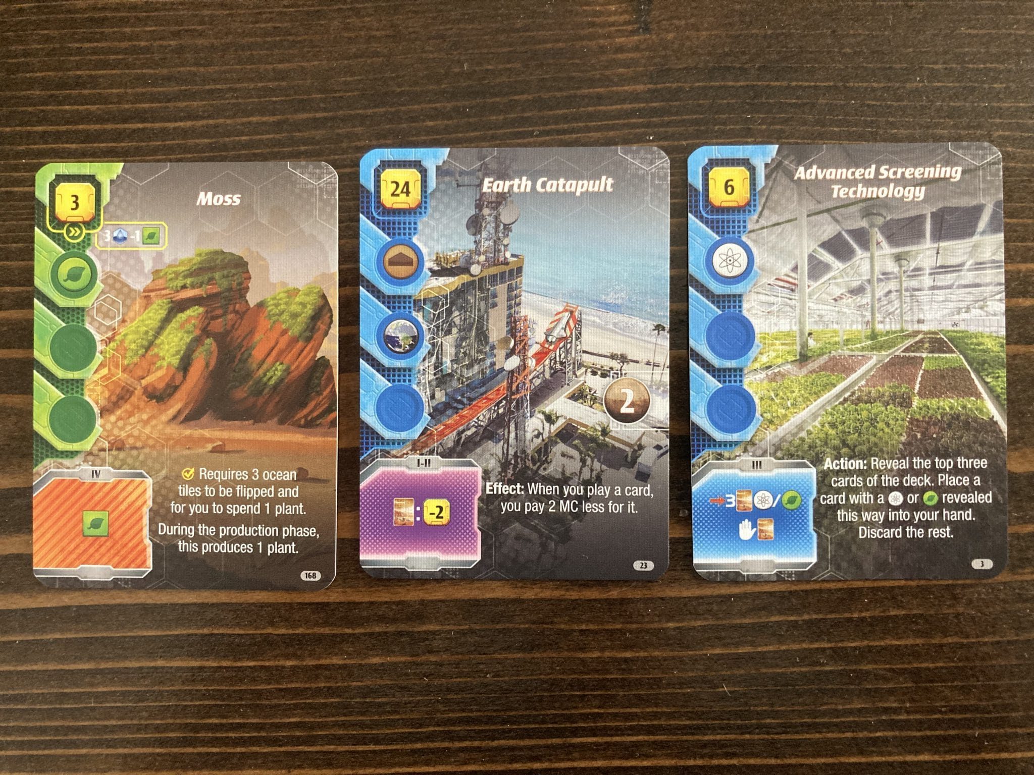
There are certain icons that, as gamers, you can expect to mean certain things. For example, there are countless resource management games that use icons like grain, logs, stone, steel, which a person could expect to be representative of resources. Likewise, we expect icons like swords to maybe reflect attack strength, or shields to be a defense value.
When you’re designing a board game, you want to tap into these recognizable themes. If you were to have a sword icon represent defense, that would certainly confuse me because it counteracts my expectations. At that point, you’re asking your players to rewire their brains and go against the grain of their experiences.
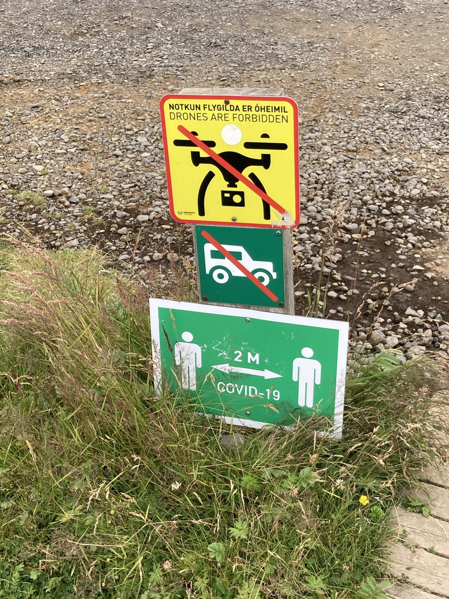
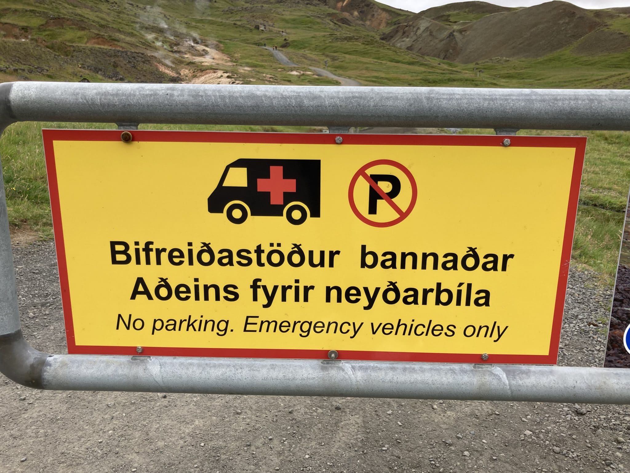
While in Iceland, I was able to recognize patterns and make assumptions about signage. A prominent number on the side of the road? Has to be a speed limit. A person walking with a red line through it? Probably shouldn’t walk there.
Even in instances where there was text in Icelandic, there would often be some sort of symbol that I could refer to for more information. Doubling down on text and iconography makes your game, and the world, more accessible. Star Realms uses this to their advantage with the shield icon in the corner of the cards and using a target icon for the attack value.
Anticipate Questions
This second key also ties into players’ expectations, just in a different way. You want to anticipate the questions that your players might have so that you can answer them before they arise.
For example, when we were driving in Iceland there was a very sudden road closure across a bridge. This was the primary way to cross the river, but now it was off-limits to us. We had to drive back 20 minutes to where we literally just came from to then spend another 20 minutes taking an alternate route just to get to the other side of the river.
In a perfect world, we would have seen notification that this road closure was going to happen. It seemed to be a nightly closure, so surely it was scheduled ahead of time. Something as simple as signage further upstream would have saved us, and other motorists, of the hassle of backtracking.
As you design a board game, think of the questions that players might have, or the information they would like to have at any given point in the game. Sure, you can bury tables of information in the rulebooks or mark conversion rates somewhere on the board, but is that the BEST way to convey the information for use?
Often times this leads to player aids or something similar in front of the players, which allows them to reference it at any time. There is a caveat, however – you don’t want to put TOO much on the player aid if it would be like sifting through a mini-rulebook. That will usually limit the positive impact of the aid.
Rulebooks that offer Frequently Asked Questions are also helpful. At the same time, if you have a FAQ page, that means that you’ve acknowledged that there’s player confusion but we’re successful in answering the question at the time it comes up. If you have FAQs that come up during playtesting and design, those should be the things that you focus on answering in the gameplay.
This is harder to find an obvious example of, but Terraforming Mars: Ares Expedition solves the problem of ambiguity in iconography by listing the translation next to the icons.
Tidy Your Landscape
Above, I mentioned that Iceland has a general lack of obstructions when it comes to their highways. There aren’t any billboards, and at least around the main highway the speed limits are consistently 90 km/hr with sections dropping to 70 in some areas and 50 as you enter village limits. This allows people to see the world around them without being bombarded with Puffin Destination advertisements.
When it comes to game design, you should tidy your landscape in a similar way. The iconography and reminder text is there to be a guide to the players, but you don’t want it to dominate the game and take away from the experience or enjoyment of the players. Use a tasteful amount of information; don’t have a heavy hand.
In the road closure example, my issues were heightened because there was already road construction on the highway. Therefore, if there had been any detour signs, they would have blended into the other signs, muddying my understanding.
Use different colors to mark things and help them stand out. At the same time, be cognizant of accessbility in terms of color blindness and how your colors interact with each other. Do your colors enhance the theme?
The same thing is true for icons. It’s helpful to have iconography, but everything doesn’t have to be an icon. Having too many icons can be just as big a problem as not having enough. Race for the Galaxy is a good example of this, in the sense that there’s a learning curve to understanding the iconography.
I Saw the Sign!
Hopefully this helps give you something to think about as you design your games! Even though I don’t speak Icelandic, understanding iconography helped give me enough idea to hold my own in a foreign country. Lean into people’s conceptions of icons to take it easy on your players, and keep them coming back for more!