Today I want to talk about one of my favorite comic book page set-ups and utilities: What I call “truncated history pages.”
If you read comics at all, you’ll know exactly what I’m talking about. These pages tend to be tight collaborations between artists and writers with the aim of catching the reader up on some piece or the entirety of a character’s history in as succinct a manner as possible. (Editor’s Note: I wish all history was taught in this way.)
But not all of these pages achieve that goal in and of themselves. They’re pretty, sure, but because they don’t add to the narrative, they might actually harm it–causing confusion or making a reader feel “out of the loop.”
New Marvel Comics Readers: Helping New Readers Be “In the Know”
Take this one, for example:
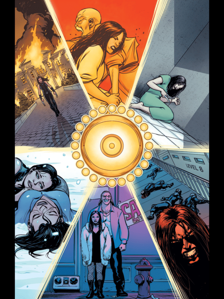
Beautiful, right?! Very much so, with the Eye of Agamotto’s shine breaking the page up into six panels; each depicting an important scene or moment from the life of Laura Kinney aka X-23 aka Wolverine.
This is lifted right out of All New Wolverine #4 (by the way…if you’re not reading All New Wolverine, you’re missing out on one of the best ongoing series in print right now.). Laura allows Dr. Strange to look into her mind to prove that she’s done “bad things” and that “bad people have done bad things to [her].”
Do you get that from the image? Yeah…sorta, but it could be better. If you come into this page without having read any of her previous comics, you get a gist, I guess. But you won’t fully grasp Laura’s point unless you know the story behind the pictures and Marvel doesn’t give you a trail to follow here.
So it is serviceable, it is adequate…but it could be better.
It could be done with a couple text boxes describing each panel and/or the inclusion of similar boxes that outline which Marvel comics contain the scenes depicted.
If you labelled the boxes 1-6 starting in the top left corner and working clockwise, you could end up with the following brief explanatory text boxes:
- My first mission: Killing Presidential candidate Greg Johnson.
- They forced my to kill my sensei, too; the only other person besides my mom to treat me as anything more than a weapon.
- I even hurt myself.
- And the trigger scent they developed…I don’t even know how many I’ve killed under its effects.
- So I ran and went from weapon to woman of the night; a prostitute.
- I was even made to kill my own mom…
Boom. Done. Most of those could fit in a Tweet and they fill out that page and enhance its impact on those who aren’t familiar with those stories tenfold.
New Marvel Comics Readers: Pointing to Other Content
Or it could have been as simple as two boxes:
- See X-23: Innocence Lost
- See NYX, Volume 1.
This should be an obvious move as it points readers to even more of Marvel’s content! And this used to be a fairly standard practice.
Check this one out:
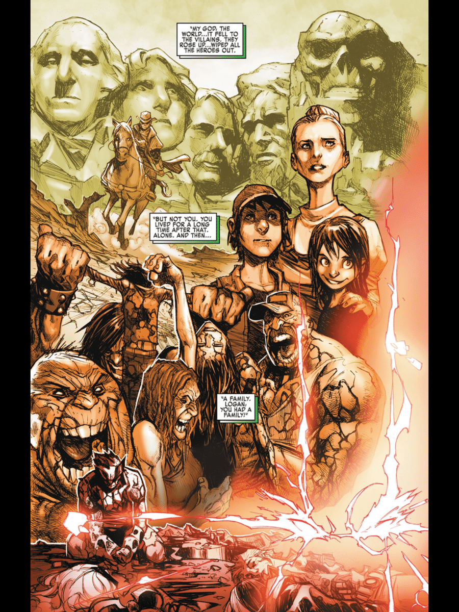
The art for this one is awesome. It is lifted from the pages of Extraordinary X-Men #3 (another fantastic run if you missed it). A lot is communicated extremely well visually here:
- Jean Grey’s eye flares in the bottom right
- The Red Skull’s visage etched into Mount Rushmore
- The Hulk Gang
- Wolverine surrounded by dead X-Men
And most of it stands alone well enough.
To help, Jean Grey’s dialogue peppers the page. Nothing intrusive; but it is definitely helpful. Her narration fills in some blanks.
I know it might seem a little heavy handed to have included a text box pointing people towards the Old Man Logan trade or issues given that its his head from which these images come, but better safe than sorry, Marvel! Why not do just that? Especially considering that that series is a humongous part of Old Man Logan’s character in current continuity.
New Marvel Comics Readers: A Small Tweak Goes A Long Way
As someone who had read all of the requisite issues to make full sense of both of these truncated history pages, I loved them! But I also sympathize with those who aren’t “in the know,” and without some supplementary information in the form of dialogue or text boxes, I can totally see how this might actually present a hurdle for readers rather than help them cross one.
Plus Marvel has long been in the (annoying) habit of relaunching titles to prevent this very same kind of “out of the know”-ness, so making these small changes seems to me to align with their goals as far as readership is concerned.
Small changes can have huge impacts and returns.


